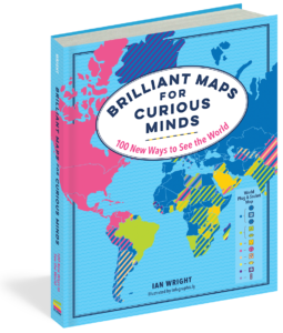
Which countries don’t have rivers? Which ones have North Korean embassies? Who drives on the “wrong” side of the road? How many national economies are bigger than California’s? And where can you still find lions in the wild? You’ll learn answers to these questions and many more from 100 highly detailed infographic maps in Brilliant Maps for Curious Minds.
Covering populations, religion, geography, nature, and everything in between, this one-of-a-kind atlas is packed with eye-opening analysis (Which nations have had female leaders?), whimsical insight (Where can’t you find a McDonald’s?), and surprising connections that illuminate the contours of culture, history, and politics.
Curious to learn more? Check out this special preview and three sample maps from Brilliant Maps for Curious Minds below, along with a Q&A with author Ian Wright. And, be sure to grab a copy of the book, available November 5!
***
Q: What originally inspired you to compile a book of unusual maps?
Ian Wright: A few things inspired me to create the Brilliant Maps website that the Brilliant Maps book is based on. First, like many people, I’ve always been interested in maps. The second inspiration came from completing another map-based project: walking the entire London Underground at street level. And third, I noticed that there were an increasing number of interesting, high-quality maps being produced online, but I felt that no one was doing a good job of curating them. Thus, the Brilliant Maps site was born.
The book owes its existence to Laura Barber at Granta Books, who got in contact with me a couple of years after the site was launched and solved many of the issues around turning the website into a book.
Q: The Brilliant Maps website has collected almost 350 maps, while your book showcases 100 of them. What’s your thought-process when finding a new map to add to the collection?
IW: A great question. There are a few things that go through my mind when selecting a map to feature. First and foremost, I look for things I personally find interesting and/or surprising that I can add to with explanation. However, sometimes I will also feature maps that I know will get a reaction. These are usually maps focused on either politics or national identity. These maps are great for getting traffic to the site, but I’ve started to move away from them due to the toxic discourse increasingly found around these topics online. Finally, I’ll also occasionally feature a humorous map that needs little to no explanation—but even these bring out the negative comments among people who can’t tell a joke from something serious.
Q: Have you always been a “cartophile,” or did something in particular make you fascinated by the subject?
IW: I’d say I’ve always been interested in maps, and I can clearly remember looking at the atlases at school when I was growing up. However, it’s not so much the geography that interests me, but how humans impact the geography—and have been impacted by it.
Walking the London Underground network was another element that made me appreciate the difference between what we see on a map and what we experience in the “real” world. The project was based on two map elements: I used the world-famous Tube map as an inspiration for a series of walks, but I wouldn’t have been able to complete the walks without Google Maps on my smartphone.
Q: The maps here look a lot more exciting than the ones you might’ve studied as a kid in school. How can we make education about maps more engaging?
IW: This is a great question—and one that’s a bit difficult to answer, because what’s interesting to one kid will differ from what’s interesting to another. However, I think using maps as a basis for telling stories can be a great place to start. Maps can play a supporting role in most subjects at school, from geography to history to economics to politics. Trying to connect maps with our day-to-day lives is another tactic for getting kids more engaged with them.
Q: What’s the best way for a reader to approach this book to get the most out of it?
IW: To use it as a starting point for curiosity about the world. This book features maps with little to no explanation. My hope is that readers will be inspired to learn more and discover something they never knew before.
Q: Beyond location and direction, what lessons can maps teach us about the world?
IW: There’s a huge amount maps can teach about the world, besides simply locations and direction. For example, almost any comparison between countries can be illustrated by and benefit from using maps: from population to GDP to the number of heavy metal bands countries have. You can convey a lot of information very quickly and simply.
However, maps can also help us to answer broad historical questions. For example, if you want to understand why the Nazis lost World War II, looking at maps helps. A simple geographic map, would show you how vast the Soviet Union was compared to Germany. A climatic map would show you how cold Russian winters are. A population map would show you how many more people lived in the Soviet Union than Germany. And finally an infrastructure map would show you how much less developed the Soviet Union was compared to Germany. All of these help with overall understanding.
Geography, climate, resources, agriculture, politics, etc. can all be shown using maps which when used together can help explain all sorts of things. For example, while it was not inevitable for English to become the dominant language of the world, all of the factors listed can be used in part to explain why it has. You could begin by looking at the geographical fact that Great Britain is an island with plenty of coal, located in just the right place to benefit from unusually warm weather due to the Gulf Stream. This provided the advantages toward colonizing what would become the United States as well as toward being the starting place for the Industrial Revolution. The US, in turn, is rich in all sorts of resources, from minerals to oil. And because of its size and agricultural productive soil, it’s been generally open to immigrants from the rest of the world. All of these facts can be shown on maps, and almost all political and economic debates can be enhanced with a better understanding of the subject.
Q: Do you think seeing the world laid out in map form emphasizes the differences or the similarities between us humans? Or a bit of both?
IW: I think the answer to this question depends on your point of view if you’re open or closed to the world. If you’re closed to the world then maps can be used to emphasize the differences between people. For example, see Trump’s attempts at building a wall or the Brexit debate in the UK.
However, if you’re open to the world, I think it can emphasize the similarities. So many of the world’s borders are arbitrary, yet they play a huge role in our lives. I could have easily have been born in the United States or the UK rather than Canada, and this would have changed how I grew up. However, no matter where people grow up they generally want the same things: good health, loving family and friends, enough food to eat and comfortable place to live. So for me the randomness of where we’re born is a good reminder to focus on the similarities. We all live on the same planet and many of the challenges we face in the 21st century, especially climate change, aren’t going to stop at political borders.
Q: What changes have you seen in the ways we interact with maps now that technologies like smartphones give people navigational tools at their fingertips?
IW: Personally, I’ve become much worse at reading maps—I don’t really have to think when using one now. That said, digital maps have been a godsend since moving to London. I can’t imagine living here without them.
Q: Have you ever tried your hand at making your own brilliant map?
IW: I’m definitely not a mapmaker, but I have made a few maps over the years, including world shipping rates, billionaires per capita in Europe, Bitcoin energy use, and whether dogs or cats are more popular in each US state. While the data behind these maps is interesting to me, they’re rarely as popular as the more beautiful maps created by the many talented mapmakers out there.
Q: Do you think maps can be a kind of visual art?
IW: I believe what is and isn’t art is subjective to an individual—but I do hope people will see these maps as artwork!
***
An interview with Ian Wright, author of Brilliant Maps for Curious Minds: 100 New Ways to See the World
(The Experiment, November 2019); theexperimentpublishing.com.


